Poverty, Pollution, and Race in California
tldr: I made an interactive 3D plot of poverty, pollution, and race data from California.
Full post
Due to a regular travel schedule, I’ve been intermittently attending PERRO’s Environmental Justice training program on Saturday mornings. One of the recent projects was to compare the number of stationary area sources of pollution in different zip codes around Illinois to the population demographics of that zip code. In the class we looked at 10 different zip codes around Chicagoland that were chosen by Jerry to make the point that when it comes to a polluted environment, race matters. But 10 samples of data isn’t really my style. So after a bit of searching I stumbled upon this data from the Office of Environmental Health Hazard Assessment (OEHHA). It contains pollution and demographic data from 1,769 zip codes in California. It isn’t Illinois, but 1769 zip code samples is much better than 10. The environmental justice course is focused on race, but racial effects are regularly intertwined with the effects of poverty. This data gives us an opportunity to get a better understanding of that relationship.
2D plots
Below is a plot of pollution data and racial/poverty demographics in 1,628 California zip codes (141 zip codes were missing data and removed). You can find the precise definitions of pollution burden (pg. 69), poverty (pg. 90), and race (pg. 94) in this pdf. In short, pollution is an average of different pollution scores, poverty is the percent of the population living below two times the federal poverty level, and race refers to the percent of the population that is non-white in the old-school sense; i.e. the percent of the population that is not white or is Latino. Here’s a set of those variables plotted against each other (click on the image for full-size):

This gives you a basic idea of the data. You’ll see Northern California (NoCal) in the gray has a range of poverty levels, but is largely white and is low pollution overall. You’ll notice that the Bay area has low levels of poverty, probably because the cost of living there is so high. You’ll notice that LA has a lot of very non-white, high poverty, high pollution areas. Overall, the most noticeable trends are the correlation of race with poverty and pollution, but no discernible correlation between poverty and pollution.
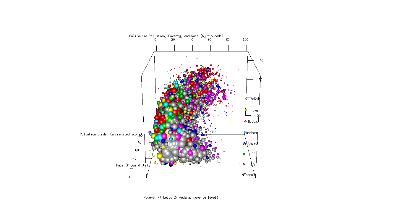
3D plots
Parsing these three plots is fun, but we can do better using a 3D visualization. Wordpress is giving me a hard time with the technology, so click the image and it’ll redirect you to my UIC page to play with the 3D plot.
(http://homepages.math.uic.edu/~therna4/webGL/index.html)
This is the same data in a 3D form with an adjustment to emphasize typical zip codes and de-emphasize atypical zip codes using differently-sized spheres. (For technical math nerds I’ll do a follow-up post with a discussion on the technique and code soon. In short, this is a non-parametric manifold visualization technique where the spheres have radii correlating to the density of the neighborhood. Maybe the technique already exists in the literature elsewhere.?)
What stands out looking at this 3D plot is that the pollution burden is almost entirely correlated with race alone at low levels of pollution. Once the non-white population reaches 30%, the pollution burden scores flatten out and then all three statistics become tightly correlated.
Some early comments and reactions have suggested that these trends are tied to the black urban migration and white flight of the 1950’s. As someone who isn’t a social scientist, I’m hoping this visualization will inform future discussions on that topic. I’ll leave that up to them. The take-away from this brief analysis and visualization should be that the data is complex and a simple linear model would miss some of these subtleties. The other take-away is that 3D visualizations can be very cool and very informative.