Crime in Chicago's Community Areas
Last time I wrote about violent crime in Chicago dropping by 44% since 2001. That created a minor stir.
This time I’m writing about all crime, which is down citywide by 25% since 2002. Let’s look at two community areas in the 25th ward: the Lower West Side and the Near West Side. While they had drops in (all) crime of 33% and 14% percent between 2018 and 2002 respectively, that picture changes after accounting for their dramatic changes in population. The Lower West Side’s population is down by 25% in that time. The Near West Side’s population is up by 35%. That means their per capita crime rate has dropped 11% and 36% respectively.
This left me with a few questions for the city at large:
What are the population changes?
How have crime rates changed?
How have per capita crime rates changed?
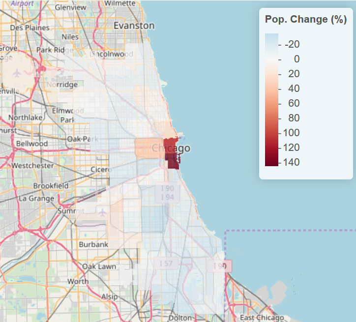
Change in Population, 2000-2016
This data comes from CMAP’s community data snapshots. This is the percent change in population. It’s the estimated 2016 population divided by the population from the 2000 census minus 1. Numbers below 0 indicate an area that is losing population. Numbers above 0 indicate an area is gaining population. For example, citywide, the ratio minus 1 is: -0.06. That means we’ve lost 6% of our population since 2000.
Note: If you’d like an interactive version of these maps, go here. Wordpress doesn’t play well with interactive webpages.

Everyone should be familiar with the exodus from the South and West sides. Everyone knows about the booming West Loop. But holy cow. The Loop has more than doubled in population since 2000! That is, population is up by 114% between 2000 and 2016. The Near South Side is up by 144%! We’ve heard about the booming Loop, but it’s another thing to see the contrast.
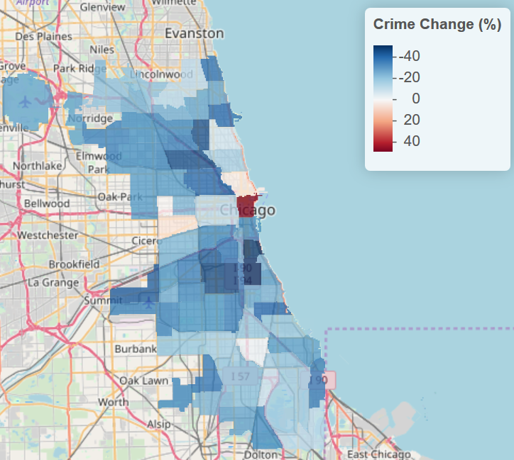
Crime Change, 2002-2018
This data comes from the city’s data portal. This is the percent change in all crime from 2002 until 2018. 2001 data was incomplete. Negative numbers mean a decrease in crime. Positive numbers are an increase. I wrote before that violent crime is down 44%. All crimes together are down 25% citywide.

Crime is up 48% in the Loop!!! Yeah, but with twice as many people around, that actually means residents of the Loop are victims less often. Hence, the per capita crime rate calculated in the next section.
Change in Per Capita Crime, 2002-2018
To combine the two previous data sets, I had to extrapolate the population from 2000 to 2002 and 2018. I then calculated the per capita crime rate (PCCR) in 2002 and 2018. This gets in the weeds. So stick with me or just skip it and know that I’ve done something reasonable ;)
The PCCR is the total number of crimes divided by the population for each year. Then I divided 2018’s PCCR by 2002’s PCCR and subtracted 1. Numbers below 0 mean that PCCR is dropping, above 0 means PCCR is rising.
A citywide example: There were 354,096 crimes in 2002 with an estimated population of 2.87 million people. That’s a PCCR of .123; i.e. for every 1,000 people there are 123 crimes reported. In 2018 there were 265,223 crimes with an estimated population of 2.70 million. That’s a PCCR of .098. If you divide .098 by .123 and subtract 1, you get -0.204. That’s a 20% reduction in PCCR citywide. That means citywide, there were 20% fewer crimes per person in 2018 than in 2002!

You can see that the PCCR has dropped in 72 community areas with the Near South Side, North Center, and McKinley Park leading the pack. It’s risen in only 5 of the city’s community areas. These areas are in the South and West sides, with West Garfield Park leading the pack. I imagine that has something to do with the new Cop Academy being put there.
I intend on doing a little more work looking at changes in violent crime, but that’ll have to wait for another day. I think a good chunk of the story is here. I should have something to talk about at the Chicago Chapter of the American Statistical Association’s annual conference. This year just so happens to be on crime and the justice system.
Sure our population is declining, but crime is falling even faster than that! That’s a good thing. Moreover, this data is of the headline-grabbing/FBI variety. This is not the more conservative Bureau of Justice Statistics variety. Again, from Matt Taibbi’s new book:
Every crime reporter will tell you there are two major outlets for national crime statistics, particularly violent crime: the annual reports by the FBI, and the Bureau of Justice Statistics. Both are outputs of the Department of Justice, but the BJS uses the same methodology every year (it’s based upon broad surveys of households, asking people if they were victims of crimes) and tends to report less alarming statistics. Newspapers inevitably use FBI stats, which use varying methodologies and somehow always come out a little scarier. Going by the FBI, violent crime fell 49% between 1993 and 2017. By the BJS, violent crime fell 74% during the same period. But the public doesn’t believe it.
If you’d like to recreate this, the code is available at my github.
Update: I had a few typos and a mistaken assumption that the 2018 CMAP update provided data for 2018. It provided data for 2016. The numbers changed by a couple percentage points here or there, but nothing changed dramatically. Again, you can go to the github above to check the work.